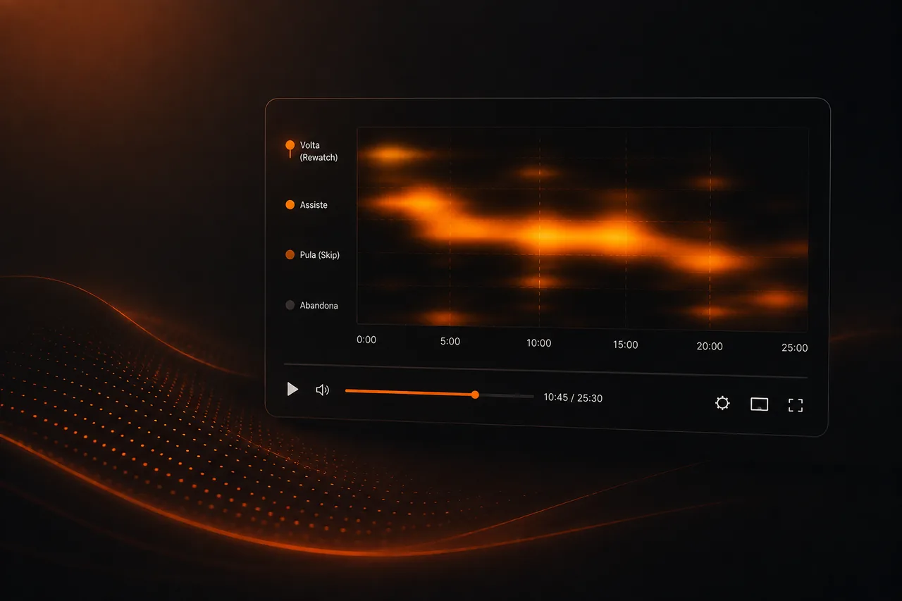
The retention curve shows how much audience remains at each moment. The heatmap adds another question: what do people do inside the video? Do they return, skip, rewatch, or leave? These patterns turn opinions about editing into observable behavior.
In a VSL, a rewatch may point to strong proof, a misunderstood price, or a line that demands attention. In a course, it may mark an important concept. The data only makes sense when you connect the point to the content.
A drop does not automatically mean a problem
Every curve drops. The point is to look for disproportionate drops and connect them to what happens in that second.
Long intros, confusing transitions, and tangents often show up as clear valleys.
Rewatch is a clue, not a conclusion
A rewatch spike may indicate value, surprise, or confusion. Watch the section and compare with comments, CTA, and conversion.
In demos, rewatch is usually positive. In simple instructions, it may signal poor explanation.
Skip shows intent
When users skip a block and keep watching, the section may be repetitive or less relevant.
In educational content with chapters, skip can be healthy navigation.
Cross the heatmap with CTA
If CTA clicks rise after a specific block, that section is probably doing commercial work.
In a VSL, this helps decide where to repeat or move calls to action without guessing.
Segmentation avoids misleading averages
Compare mobile and desktop, cold and warm traffic, campaigns, and creatives. A single average can hide that one segment leaves much earlier.
That diagnosis guides edits and even specific video versions.
How to put this into practice
Mark on your script the moments that serve a function: hook, lead, mechanism, proof, offer, and CTA. Then overlay those markers on the video curve. This read is far more useful than debating edits by taste, because it shows exactly which part of the message aligns with a drop, rewatch, or move toward purchase.
Also build a library of learnings by offer. Save hooks, leads, big ideas, proof sections, and CTAs that performed well, always with traffic, ticket, and period context. An internal swipe file with data beats copying a foreign-market VSL without knowing if it worked for the same audience.
Metrics worth tracking alongside the decision
Play rate, first-minute retention, retention to price, CTA clicks, and conversion form a baseline read. For paid media, also connect hook rate, CPA, and ROAS. When possible, segment by creative, device, and source. The overall average can hide a VSL that excels for one audience and falls flat for another.
Conclusion
Heatmaps help you find where attention changes behavior. Use the data to form hypotheses, then check the actual content at that point.
Retention, rewatch, skip, and CTA together tell a far more useful story than average duration alone.
Frequently asked questions
No. It complements the curve by showing rewatch and skip patterns.
No. It can be value or confusion, depending on the content.
Look for drops in the lead, proof spikes, behavior near price, and CTA exposure.
If you read nothing else
- Heatmaps turn retention into a map — not a single percentage.
- Rewatches often signal confusion or high value; skips signal friction.
- Overlay heatmaps on your script to build a precise edit list.
- Segment by traffic source — the same video behaves differently by audience.
Atomicat Team
The team behind AtomicPlayer — writing about video conversion, retention, and the infrastructure that makes both measurable.